When Tim Berners-Lee created the first web browser in the early 1990s, the links in the text were identifable because they were underlined. It wasn't possible to change the color of the text as Berners-Lee did his work on an early NeXT workstation. While these machines had plenty of cool features (see another article I wrote), they only had a four tone gray scale display. Modern browsers, and the displays we view them on, come in color.
Yet underlined links are still used in every web browser. I hate it. I
think it's unnecessary and it makes the text appear busier and more
difficult to read. So, the first thing I do with any new browser is to
uncheck the "Underline Links" button. Here's a contrived example of
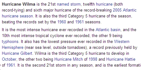
the difference this can make. First, here's some text from Wikipedia
without underlines.
 By choosing a darkish blue for links, the main text flows well from
black to blue and back again. Yet it's still easy to figure out where
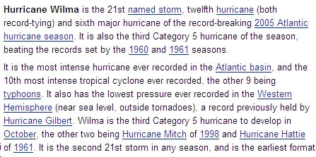
to point your mouse to click on a link. Now the same text with underlines:

If everything is a link, why differentiate?
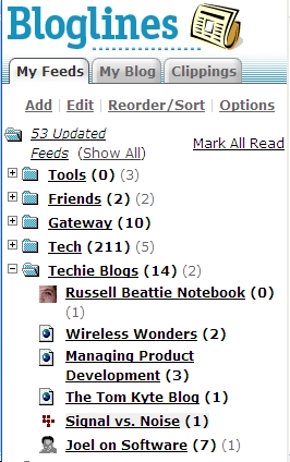
A real, non-contrived example is the list of feeds as it currently appears on bloglines.com, shown below. This appears in a separate frame on the left side of the browser window. Clicking on any one of these links changes the content in the big frame on the right side of the browser. This is essentially a menu -- every one of these lines is a link. An additional visual cue to demonstrate that these are links is not needed, and yet, their stylesheet forces it on me.

Moving on to the next example... "I know there's a link here somewhere"
Another bad use of underlines is assuming that users haven't turned off underlined links. The Signal vs. Noise (SvN) blog, from 37signals, is guilty of this assumption. Ironically they are also the authors of the book Defensive Design for the Web (as well as the Ruby On Rails web framework and various web applications).
Here's how I see text on a snippet from SvN:
 Quick - where do you click to read the source article? There is no
visual cue! When I move my mouse around, I find that the link is
magically highlighted when I move over it.
 Trying to follow links from this blog is like playing a video game.
Since most people either like the underlines or don't ever bother to change any preferences, I'll accept that this is a personal choice. But, if a site, such as SvN, decides that it prefers to use only underlines as visual cues for links, then it should be sure to enforce this using its stylesheet. It's not hard. In fact, 37signals already does so on their home page. (The SvN page does get positive marks from me for deciding that one visual cue to show links is enough -- they just need to make sure that their users see that one cue)
I need to finish this rant with clarifications about Bloglines and 37signals. I like the way the 37signals guys think and I own (and recommend) the above-mentioned book. I use Bloglines every day (although lately I've been forcing myself to use the invisibility cloak greasemonkey script to limit the times I catch up on news). Now, if they could just understand the way I feel about underlines.
No comments:
Post a Comment